
Words by Leanne Cloudsdale
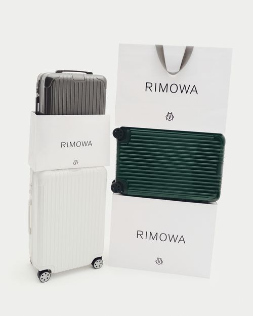
Contextualising Rihanna isn’t easy – which meant the role of creating the branding for her first fashion house had to be handled by the experts. LVMH approached London-based design agency Commission Studio to generate the identity for Fenty, a decidedly different, digital venture. Founded by creative directors David McFarline and Christopher Moorby, Commission Studio have a heavyweight portfolio of luxury clients and were the masterminds behind the recent rebranding of the German luggage powerhouse RIMOWA.
Following on from the overwhelming international success of Fenty Beauty, part of Rihanna’s manifesto for her new clothing line was to inspire, empower, clash and include. At every virtual touchpoint, the branding had to work hard to ensure these non-negotiables were accurately conveyed and offered consumers a sense of Rihanna’s reputation as a modern-day game-changing boundary pusher.
Commission Studio worked closely with the artist herself throughout every stage of the development process, alongside her trusted Fenty insiders and the strategy team from LVMH. Speaking about presenting ideas and mood boards to one of the most famous women in the world, Moorby explained how, “She was exceptionally positive, super attentive and very hands-on during every meeting. We found her to be decisive and direct – she doesn’t say ‘no’ to anything because she believes it disrupts creative momentum.”
The consumer landscape is almost unrecognisable since LVMH launched their last fashion house Christian Lacroix in 1987, which meant adopting an entirely new approach. Fenty is predicted to be retailing 80% online with no physical stores (aside from the occasional pop-up) and because of this, it was imperative for Commission to create a sense of drama on-screen and ceremony with the packaging. Describing the inspiration behind the design of an entirely new wordmark for the brand, McFarline said, “The new wordmark was drawn from scratch. The distinctive letter ‘F’ with the strokes overlapping references Rihanna’s own handwriting and the reverse ‘N’ is a legacy nod to the Fenty Beauty logo. We used a special adaptation of the Grilli typeface GT America Compressed Light for the brand typeface with the ‘N’s reversed as part of the standard character set. Everything is clean and modern – specifically designed to work well on small scale devices such as phone and tablets. Across the packaging the logos were applied with gold foil and a 3D sculpted diamond emboss to give that luxe feel”
Building a brand with unisex appeal was something Rihanna felt very strongly about and is reflected in her bold choice of colourway. Moorby remembered, “she explained to us that even though it was a high-end womenswear brand, she wanted to use a positive colour that anyone would be happy to wear – not just women. The cyan blue with an embossed ripple effect we’ve used across all the packaging is reminiscent of the colour and surface of the ocean around the island of Barbados, her home country.”
Typically, monograms have always been an integral communication tool for luxury brands and Commission Studio wanted to develop a contemporary version that could be used throughout the Fenty collection. ‘The Maze’ logo was a fresh interpretation of this and includes every letter of the brand name. At first glance it could be a QR code, electronic circuitry, a Chinese character, or a Greek key – what makes ‘The Maze’ unique is how it manages to be modern and familiar at the same time.
The uncentred, randomised logo positioning conveys a sense of movement and urgency. It successfully reels us in, like a news ticker of headlines reporting on Rihanna’s constantly evolving universe. A static, formulaic approach to the branding design would never have worked for the chameleonic queen of self-innovation – the first woman ever to launch a fashion maison with the world’s leading luxury conglomerate.